Impatience got the best of me. My home town has very little in couch selection; I knew I needed a sectional so that everyone got a seat on movie night, and my husband insisted a chaise did not count as extra seating. So when I came across a seven seater sectional in the dark gray colour I wanted, I figured I could make it work as the arms were a classic shape.
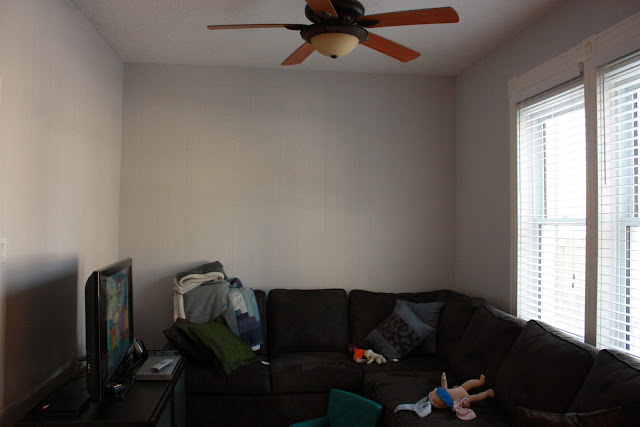
So what's the problem? you may ask? I suffer from a lack of spatial ability of sorts. Either that, or I just need to learn to use a measuring tape. Warning: NOT a pretty picture ahead:
This.Couch. Is.Huge. It ate up two walls of my living room, pushed my T.V. in front of the heater and sucks up the little natural light this room gets. Oops.
Life goes on. I needed to make this room bright and feminine, so I turned to MyDeco to create a moodboard to see if this was possible. No, they do not have my giant couch in their archives but I came close with the colour and shape:
 You can go here to check out the sources for all of these items and keep and eye on any future moodboards I make. I love the bright and cheery yellow and the feminine accessories and lighting. Of course, I kept the furniture light and leggy to downplay the heaviness of the couch. I'm not sure if all of the furniture is in the budget (I may have to make compromises!) but I am excited about that coffee table, especially since cb2 is coming to Toronto in the summer!
Do you think it works?! I may have a new addiction at MyDeco!


Ooooh, that coffee table is fab. It's not a huge mistake. You'll find a solution and rock it. What about a wall niche?
ReplyDeletechristian louboutin pas cher
ReplyDeletecoach outlet online
cheap oakley sunglasses
adidas store
dolce and gabbana outlet online
longchamp bags
louboutin sale
polo ralph lauren outle
ralph lauren outlet online
fitflops sale clearance
chenshanshan20170304